¶ Navigation and Usage
¶ SPATIAL main window
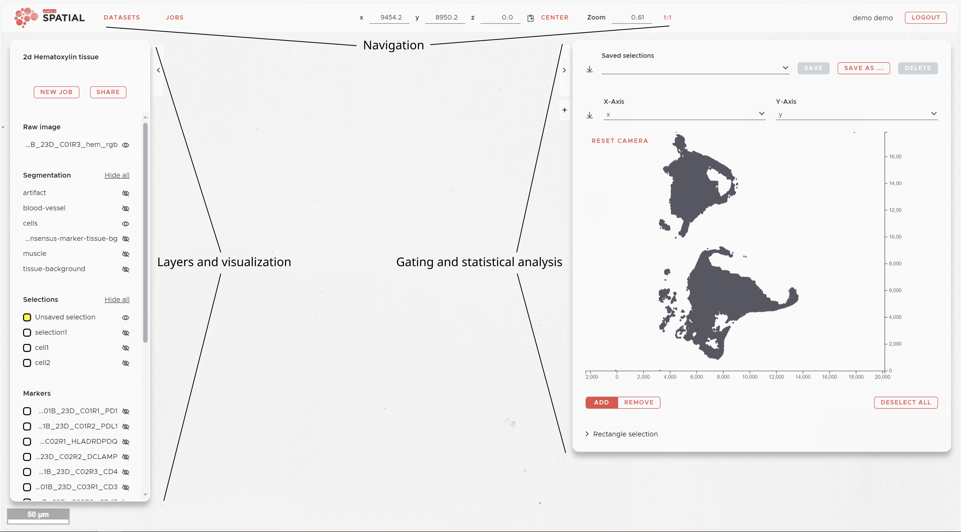
The SPATIAL main window shows three panels surrounding your image data. On the left is the Visualization panel, which displays all available image, segmentation, selection, and marker layers. On the right is the Statistics panel, which gives you access to marker intensity visualization, manual gating, dimensionality reduction results, and spatial analysis outputs. Both panels can be collapsed using the arrowheads at their top corners.
The top panel shows your current coordinates and provides access to the main controls of SPATIAL, including the NEW JOB button for submitting analysis jobs.
¶ Basic usage and inputs
- Move image: Press and hold the left mouse button while moving the mouse.
- Zoom: Hold Ctrl and use the mouse wheel. SPATIAL will zoom into the region under your mouse pointer. Note that SPATIAL uses a pyramidal image format and loads only the resolution needed — you may experience a brief delay when zooming into high-resolution data.
- Panel and font size: Point your mouse at one of the panels (not the graph area), hold Ctrl, and use the mouse wheel to adjust panel and font size in line with your browser's zoom settings.
- Jump to a location: Right-click on a location in the image to jump to it.
- Move along z: Use the mouse wheel to move along the z-axis.
- Paste coordinates: To jump to a specific location, paste previously copied coordinates from your system clipboard.
¶ Navigation panel

The navigation panel keeps you informed of your current position in the dataset and provides access to the main controls of SPATIAL.
- NEW JOB button: Submit a new analysis job — Registration, Segmentation, Nucleus Expansion, Intensity Map, t-SNE, UMAP, Automatic Cell Type Detection, Neighborhood Enrichment, Recurrent Neighborhoods, or Plotting. See Submitting Jobs for details on each job type.
- JOBS button: Opens the job list, showing the status of all running and completed jobs for the current dataset.
- SHARE button: Creates a shareable link that allows collaborators to view your dataset without requiring an account.
- DATASETS button: Returns you to the dataset browser, where you can upload new datasets or switch to a different one.
- x, y, and z coordinates: Enter a specific location in the coordinate fields and press Enter to jump there. The small icon next to the z coordinate copies the current position to the clipboard.
- CENTER button: Centers the current dataset in the viewer.
- 1:1 button: Resets the zoom to 1:1.
- Camera icon: Takes a screenshot of the current view.
¶ Visualization panel
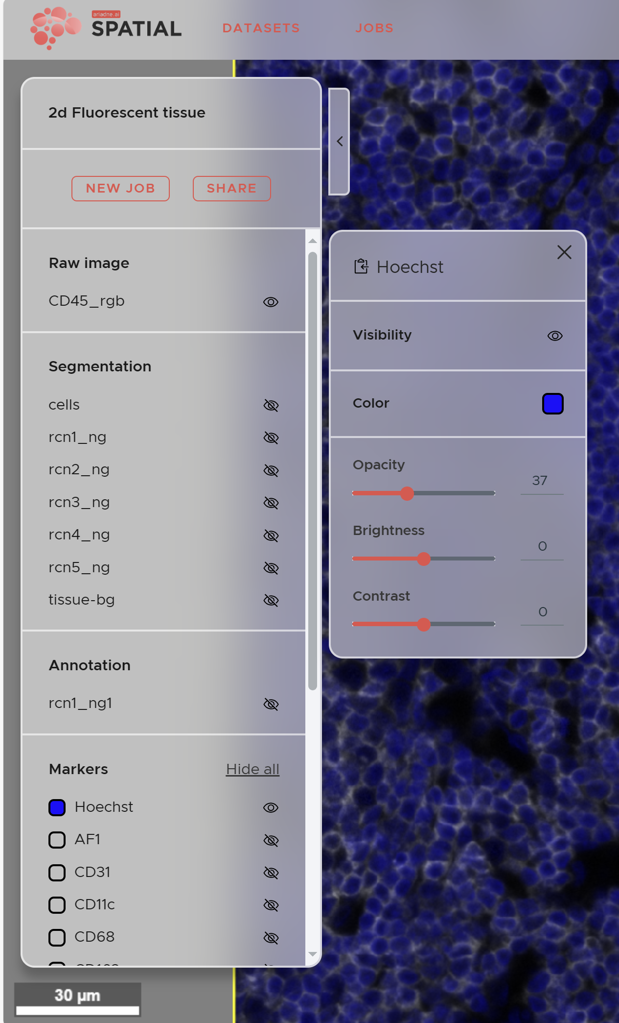
The Visualization panel on the left side of the main window controls all layers in your dataset, organized into categories: image channels, segmentations, selections, and marker layers. Categories appear as your data is processed — for example, the Segmentation category will appear once a segmentation job has completed.
- Show/hide a layer: Click the eye icon next to its name.
- Adjust appearance: Click the layer name to access Opacity, Brightness, and Contrast controls.
- Change layer color: Click the colored square next to the layer name.
¶ Statistics panel (right panel)
The Statistics panel on the right gives you access to per-cell marker data and all analysis results. Click + to add a new view and select from the available options: Markers, t-SNE, UMAP, Recurrent Neighborhoods, Neighborhood Enrichment, or Plotting results.
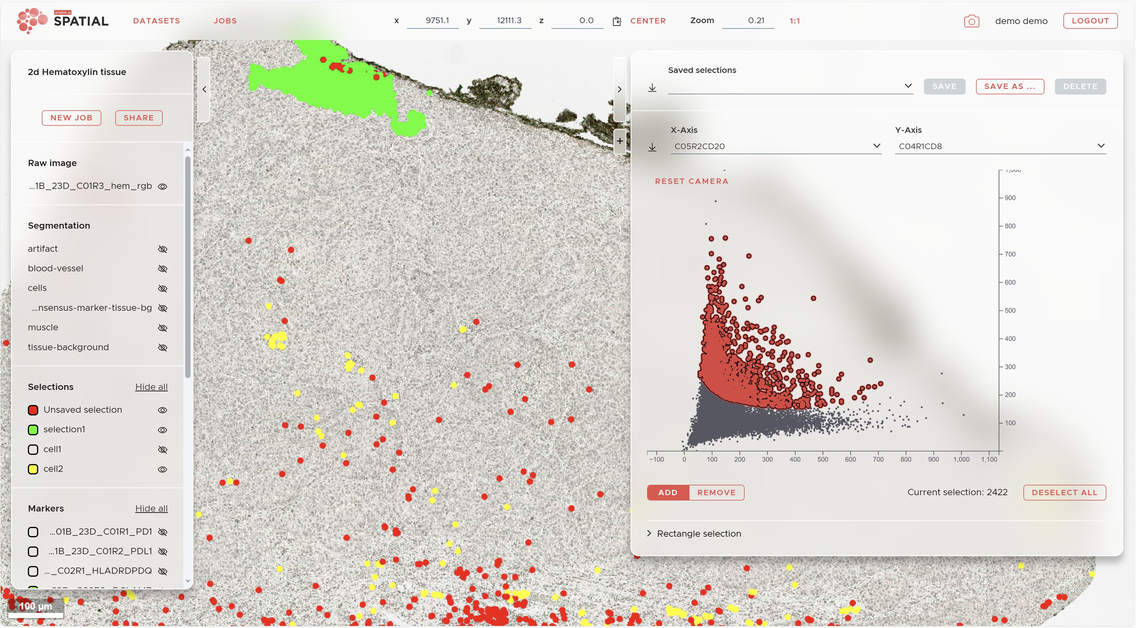
¶ Manual gating
Manual gating lets you define cell populations (Selections) based on marker co-expression directly in the scatter plot.
- Use the two dropdown menus at the top of the plot to select markers for the x- and y-axes.
- Hold Shift and drag with the left mouse button to draw a selection region. A red overlay will appear on the selected cells.
- Switch between ADD and REMOVE mode using the buttons at the lower left of the plot to refine your selection.
- To gate on additional markers, change the axis dropdowns — your current selection is preserved.
- For precise gating, switch to Rectangle selection at the bottom left and enter exact values for your gate boundaries.
- When finished, click SAVE AS... to save the selection. It will appear in the Selections section of the Visualization panel.
- Click DESELECT ALL to start defining the next cell population.
For more information on how Selections are used in downstream analysis, see Mappings & Properties.
¶ t-SNE and UMAP results
Once a t-SNE or UMAP job has completed, its results are available in the Statistics panel. Select the experiment from the dropdown and use the same gating tools described above to draw Selections directly on the dimensionality reduction plot. Cells belonging to each gate are simultaneously highlighted in the image viewer.
¶ Neighborhood Enrichment
Access completed Neighborhood Enrichment results by clicking + in the Statistics panel and selecting Neighborhood enrichment. Choose your experiment from the dropdown and open the Details tab to view the pairwise enrichment matrix. Results can be downloaded as a ZIP file.
For a description of the Neighborhood Enrichment method, see the Statistical analysis page.
¶ Recurrent Spatial Neighborhoods (RCN)
Access completed RCN results by clicking + in the Statistics panel and selecting Recurrent neighborhoods. Choose your experiment from the dropdown and open the Details tab to view the composition of each neighborhood. The RCN assignments are also added as Selections in the Visualization panel, allowing you to see where each microenvironment occurs in the tissue. Results can be downloaded as a ZIP file.
For a description of the RCN method, see the Statistical analysis page.